


Responsive design: why is it necessary in the age of gadgets?
Responsive design in the 21st century is a basic thing for any website. People are so used to having everything done for them that they have forgotten the days when websites took more than a minute to load. Although only 12-15 years have passed.


What is responsive design?
Responsive design is the optimization of website design so that all pages automatically adjust to the size of the user’s screen. The main goal of responsive design is to provide a comfortable and convenient browsing experience, regardless of the device the visitor uses.
In an era when everyone has a mobile device (and they have different sizes), responsive design comes first, because if a person does not like the appearance of the site, he or she will immediately leave it and will not become your client.
Why is responsive design important for SEO?
Let’s take a look at the main features of responsive design and understand why it is important for SEO and users in general.
- Mobile optimization:
- Most Internet users today access the web from mobile devices. In 2015, Google announced that the number of mobile search queries exceeded 50%. This led to the fact that Google began to favor websites with mobile optimization. Sites with responsive design get better positions in search results because they provide a better user experience on mobile devices.
- Improve user experience (UX):
- Users expect a website to be convenient and easy to use on their phone, computer, and tablet. Responsive design allows people to intuitively understand the site and navigate it more easily. Also, a pleasant and clear design keeps people on the site longer and thus improves the behavioral factor, which also affects SEO.
- Page loading speed:
- Responsive sites are usually faster to load because they are optimized for any device. Google considers website loading speed to be a very important metric for ranking. Pages that load quickly are more attractive to users and increase the chance of a targeted action.
- A single URL for all devices:
- When a page has the same URL on any device, it is easier for search engines to index such sites and prevents duplicate content. Sometimes, instead of using the same URL, specialists create a separate version of the site, called m.example.com. This letter “m” stands for the mobile version. Also, responsive design ensures more efficient use of the crawling budget.
- Reduced bounce rate:
- If a website takes a long time to load or has an incomprehensible structure, the chance that a person will leave and never return increases several times. Therefore, responsive design allows you to reduce this indicator, keep users on the site longer and increase the chance of a targeted action (purchase, form filling, etc.)

Increase visibility
for your business: SEO solution for growth!
How to create a responsive design?
Let’s look at the principles of responsive design and understand how to optimize your website for different devices
- Use a flexible grid: A flexible grid allows you to create layouts that automatically adjust to the size of the screen. Use relative units of measurement (use percentages, not pixels) to determine the width of elements.
- Media queries: Media queries allow you to apply different CSS styles depending on the device characteristics. For example, on a computer version, an image has a width of 100 pixels, but on a screen with a resolution of less than 780 pixels, the image will be reduced to 60 pixels.
- Flexible images and videos: Images and videos should automatically adjust to the size of the screen. Use the “max-width: 100%;” property to ensure content flexibility. In this case, the image or video will occupy the entire width of the screen regardless of size.
- Simple and intuitive menu: the menu should be easily accessible and understandable on all devices. For mobile versions, a hamburger menu is usually used to save screen space and ensure easy navigation.
- Cross-device testing: Test your site on different devices and browsers to make sure it looks and works correctly in all conditions Use tools like Google Mobile-Friendly Test to evaluate the mobile-friendliness of your site.

- Use responsive frameworks: Frameworks like Bootstrap or Foundation make it much easier to create responsive designs. They provide ready-made styles that can be easily customized for any device.
- Optimize fonts and icons: use fonts and icons that can be optimized for different devices. Fonts should be readable and icons should be scalable without losing quality. Quite often it happens that on a phone it is impossible to determine which icon you see in front of you, which negatively affects people’s opinion of your website.

Website responsiveness is a very important element for any resource, but not all specialists spend their time on it. Our task is to draw the attention of programmers and business owners to the fact that most people now access websites from mobile devices, and optimization for different screens is very important and directly affects website conversions.
Advantages of responsive design
- Improving the user experience: Responsive design ensures that your website looks comfortable and pleasant on any device. This means that users can easily navigate the site and find what they need. It’s also easier for them to read texts, view images, and interact with other elements such as buttons.
- Improved loading speed: As you might have already realized, responsive design improves the loading speed of a website and has a positive impact on its ranking.
- Benefits for SEO: Google prefers responsive websites (because its main task is to meet the needs of users and optimize their interaction with websites). Also, website adaptability helps to avoid duplication of content.
- Reduced development and maintenance costs: instead of developing and maintaining separate versions of your website for different devices, you only need to adapt the main version to different screens. In this case, the site will automatically adjust to the device. This significantly reduces the cost of developing, maintaining, and promoting such sites.
- Increased conversions: users who get a positive experience from interacting with your website are more likely to perform targeted actions (purchase, registration, form filling). Responsive design increases user satisfaction and, as a result, conversion.
Increase visibility
for your business: SEO solution for growth!
How to check website responsiveness?
There are several methods and tools for checking website responsiveness:
- Using developer tools in browsers: modern browsers such as Google Chrome, Safari, and others have built-in tools that allow you to check the responsiveness of your site:
- Google Chrome: let’s take the most popular search engine as an example. To check, open the site, right-click and select “Inspect” (or simply press “Ctrl + Shift + I”). In the upper part of the toolbar (on the right side), click the mobile device icon (Fig. 1) and select different screen sizes to check the adaptability (Fig. 2).
- Google Chrome: let’s take the most popular search engine as an example. To check, open the site, right-click and select “Inspect” (or simply press “Ctrl + Shift + I”). In the upper part of the toolbar (on the right side), click the mobile device icon (Fig. 1) and select different screen sizes to check the adaptability (Fig. 2).
- Using online tools:
- Google Mobile-Friendly Test: A tool from Google that evaluates how mobile-friendly your website is. Just enter the URL of your website and you will see a detailed report on mobile optimization.
- Responsinator: An online tool that shows how your website looks on different devices and screen sizes. Based on this information, you will be able to understand from your own experience how convenient your site is for different screens.
- Testing on real devices: The third and most accurate option is to test your optimization on different devices. Take smartphones, tablets, laptops, and computers with different screen sizes and see how the site will look on each of them. This way you will be able to evaluate the quality of adaptation 100%.

Conclusion
Responsive design is a critical element of any modern website and has a significant impact on website rankings, user opinion, and conversion. From this article, you can understand what website responsiveness is and why it is needed. If you have any doubts about the correctness of your actions, contact SEObanda specialists and they will help you improve your website’s responsiveness and technical setup for better rankings.
You may also like it
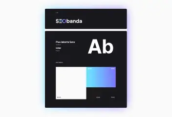
Brand identity: The key to brand recognition and SEO success
Every product has its own unique feature that sets it apart from other brands. It could be a special font, a unique mascot, or an interesting logo with the right...
What is a dynamic URL and its impact on SEO
A dynamic URL (Uniform Resource Locator) is a web address that changes depending on the user's request or specific parameters. It differs from a static
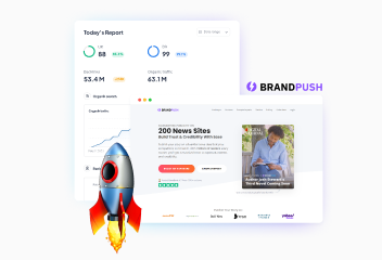
Press releases as an important part of your SEO strategy: Brand Push Services
SEO is the best promotion on the Internet that helps attract more potential clients and improve your market position. The use of press releases is an important SEO...